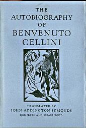
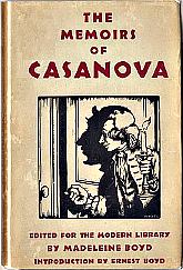
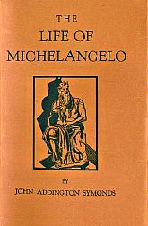
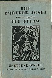
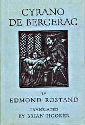
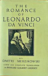
"The first pictorial jacket appeared in March 1928 on Dmitri Merejkowski's The Romance of Leoardo da Vinci. Interest in the appearance of the work in an inexpensive edition was so great, and the advance sale so large, that Cerf and Klopfer decided to issue the book in a specially designed jacket of its own. They hoped that this would encourage booksellers to seek additional sales by displaying it separately from regular Modern Library stock."
Some of these designs were used in the late 1920's gift sets.
ML used the same basic design on a few other titles, but only for a brief period. Most books of the period (1928 - 1932) carried the standard typographical jacket design of the period (Toledano type 4) until around 1932 when many titles were published with pictorial dust jackets, some close to - but not exactly in - the original front panel pictorial design, as well as the typographical design. (See Pictorial DJs 1932-1938 for well over 100 examples.)
early pictorial |
later pictorial |
typographical |
 |
|
 |
Here are the characteristics of these earliest pictorial jackets, followed by all known examples:
- spine printing was horizontal
- no logo on front or spine
- dual numbers or no numbers on spine
- no horizontal bars on front
- image enclosed within a square
